Westcoast

Westcoast

Westcoast distribute some of the best-known global IT brands to resellers, retailers and other organisations in UK, the Republic of Ireland and mainland Europe. Westcoast are one of the largest privately owned companies in the UK.

Client: Westcoast
Agency: Revere
Industry: Technology
My Role: Art Direction & Design

There is something for everyone

with ASUS and Westcoast

I was tasked with developing a creative campaign to drive awareness of the new ASUS range available through Westcoast, using a ‘lights-on’ approach to engage resellers. My focus was on promoting the Gaming and Notebook ranges, while clearly communicating the overarching message: there’s something for everyone with ASUS and Westcoast.

Tags: Emails, Digital Banners, Social Posts, Animated Social Posts & Video Storyboards

Softcat

Softcat

Softcat provide bespoke, innovative end-to-end technology solutions to enable businesses and organisations to succeed. Focusing on advice, procurement and services across three key IT priorities – Hybrid Infrastructure, Digital Workspace and Cyber Security.

Client: Softcat
Agency: Revere
Industry: Cerber Security
My Role: Art Direction & Design

Always On Cloud Security

Cyber Security

The objective was to build on the existing proposition, where customers seek greater visibility for their users while maintaining seamless security. The goal was to ensure a consistent user experience and security framework, regardless of location.

I developed an integrated creative solution to elevate the visibility of the ‘Always On’ event. This included a suite of visual imagery designed to support and communicate the event’s three core pillars: Connect, Protect, and Enable.

Tags: Emails, Digital Event Banners, Social Posts & Video Storyboards

Our mission is to secure and protect employees, no matter where they’re located.

Softcat

The creative suite of imagery was strategically applied across all event marketing assets, including social media content, targeted EDMs, digital banners, and a high-impact launch video. Each element was designed to deliver a cohesive and engaging visual experience that aligned with the event’s core themes.

By reinforcing the pillars of Connect, Protect, and Enable, the campaign established a clear and consistent narrative across every customer touchpoint. The use of bold visuals, dynamic layouts, and a unified design language helped communicate key messages with clarity and energy.

This fully integrated approach not only elevated the visibility of the ‘Always On’ event but also played a pivotal role in its success—driving engagement, enhancing brand perception, and earning positive feedback from both internal stakeholders and external audiences.

Testimonials

Dermalogica

Dermalogica

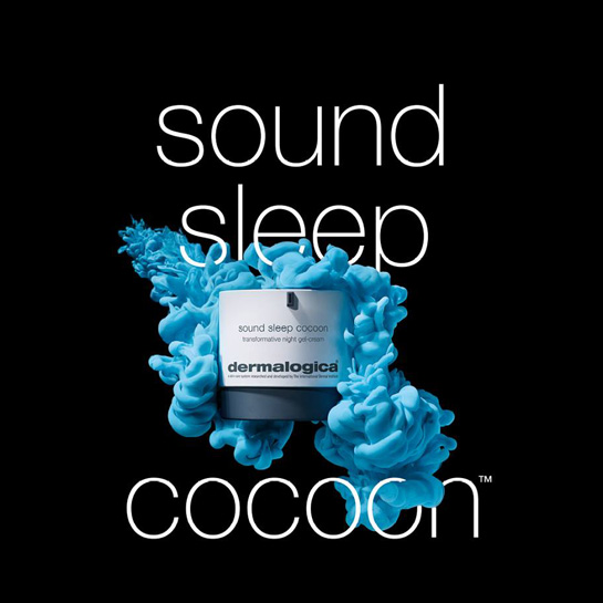
Dermalogica are the industry’s leading skincare professionals having received over 300 awards in their dedication to skin health worldwide.

The company was founded in 1986 by Jane Wurwand after it came to her attention that very few skin care ‘professionals’ focus their attention on continuing their skin health education.

Unlike many other skincare brands, Dermalogica’s business model is built on education and training. They focus on skin health, rather than beauty.

Dermalogica’s carefully designed formulas and high-quality ingredients help you get the most out of your skincare products and overall skin health.

Client: Dermalogica
Agency: Unilever
Industry: Skincare
My Role: Head of Design UK & Ireland

Leadership

Head of Design UK & Ireland

In 2017, I was invited to serve as Dermalogica’s Head of Design for the UK and Ireland. At the time, Dermalogica had recently been acquired by Unilever and was seeking a strong design leader to drive creative direction in the UK, in collaboration with the global team.

In a short period, I implemented a new creative briefing structure, unified the brand’s visual output across multiple channels, and redefined the creative vision to align with both local and global objectives.

By streamlining the design process and fostering stronger cross-functional collaboration, I was able to deliver two of Dermalogica’s most commercially successful and visually impactful campaigns that year.

Streamlining

Agile, Craftsmanship & Responsiveness

I quickly implemented a new creative briefing system that enabled my design department to unify our output across multiple channels and respond with more agilelity to incoming briefs. This streamlined approach allowed my team to shift focus from navigating procedural ‘red tape’ to honing the craftsmanship and strategic impact of our creative work.

Internal & External Communications

Overhauling and unifying Dermalogica's brand

In addition to creating some of Dermalogica’s most commercially successful campaigns, I also undertook a comprehensive redesign of every communication piece across the brand. By implementing a cohesive and unified visual identity, I helped establish a consistent brand presence that reflects the quality and integrity of Dermalogica’s products. Thanks to this transformation, the future of Dermalogica now looks as healthy and radiant as the skin it’s known to nourish.

IIAA

IIAA

The iiaa is a leading distributor of scientific, research-backed and, most importantly, healthy skincare. A portfolio of brands that make a real difference to your skin with as little impact on the environment as possible. As a member of the Beauty Companies Association (BCA), they continually help to develop the direction of the industry.

Brands: Advanced Nutrition Programme, Environ, Jane Iredale
Client: IIAA
Industry: Supplements, Skincare & Colour Cosmetics
My Role: Design Director

Inspiration

We provide something that is totally recyclable – but that’s not our measure of success.
David Alpert

I was asked to support the transition of IIAA’s most senior designer into the role of Head of Design, while also helping to guide the studio’s creative output in alignment with the Feed, Fortify, Finish™ mantra.

In addition, I led the development of marketing assets for new product launches across IIAA’s key brands: Advanced Nutrition Programme™, Environ®, and Jane Iredale. This included concept development, visual direction, and execution across digital and print channels, ensuring each campaign reflected the brand’s values and resonated with its target audience.

Brief

I was asked to assist with the transition of IIAA’s most senior designer into the role of Head of Design and to help direct the creative output of the studio with the Feed, Fortify, Finish™  mantra. In addition, I led and developed the creative of the marketing assets for new product launches across IIAA’s Advanced Nutrition Programme™, Environ® and Jane Iredale ranges.

John is an absolute pleasure to work with. Taking each design challenge in his stride and striving for excellence on each project.
Ewa Johnson
Tags: Digital Banners, Event Marketing, Editorials, Packaging, POSM, Products Brochures & Social Posts

Result

Each of the IIAA’s three brands came with their own unique creative problems, each had their own very distinct visual language.

Advanced Nutrition Programme™ was routed in its passion for being environmentally friendly whilst fundamentally a supplement that was fantastic for your skin’s inner health. Everything, from sourcing vegetable inks and recycled paper stocks to bio degradable laminates. Every element of the creative and design had to be carefully considered to embody this ethos.

Environ®, driven by its scientific approach to skin care and skin routine, subsequently had a very different creative approach. Focusing on the technical side of skincare, it was imperative for the creative to make the data digestible for the customer. All key touchpoints, from social posts to packaging and everything in-between was aligned to making the science accessible.

Jane Iredale, with its beautiful earthy colour cosmetics and its philosophy of finding alternatives to preservative systems and parabens meant that the creative had to be vibrant and engaging whilst reinforcing the brands core messaging.

Testimonials

Dynabook

Dynabook

Dynabook is a Japanese laptop manufacturer owned by Sharp. Dynabook was owned and branded as Toshiba until 2018 when the laptop sector of the business was rebranded and sold to Sharp

Dynabook produces laptops specifically for a B2B market recently moved to created education specific devices.

Client: Dynabook
Agency: Revere
Industry: Technology
My Role: Art Direction & Design

Showcasing a new proposition

Educational Thought Leadership Hub

As part of their 2022 Thought Leadership initiative, Dynabook UK developed an insight-driven Industries Hub.

I was brought in to expand the original campaign by creating a third vertical focused on Education, which was divided into two distinct audiences: Schools and Higher/Further Education (HEFE).

To visually distinguish and promote the new Education vertical, I applied Dynabook’s brand colours, dynamic image cropping, and introduced chevron graphics to create a sense of movement and direction. By selecting imagery that highlighted lecturers and the supportive role teachers play in the classroom, I was able to craft a visual narrative that underscored Dynabook’s commitment to empowering both educators and students.

Tags: Art and Design Direction, Website, EDMs, Infographic, Guide, Social Posts