O2

O2

VCCP is an international integrated communications agency, founded in 2002 by Charles (V), Rooney (C), Adrian (C) and Ian (P) on the principles of simplicity, collaboration and integration around ideas rather than channels. We are the challenger agency for challenger brands and transform the fortunes of our clients by challenging and disrupting the categories it operates in. With offices in Berlin, London, Madrid, New York, Prague, San Francisco and Sydney, VCCP produces award-winning work for clients including O2, comparethemarket.com, easyJet, Canon and Cadbury.

Brand: O2 Telefónica UK
Agency: VCCP
Industry: Telecommunications
My Role: Design Director

Inspiration

Breathe it all in

“Breathe it all in” is inspired by the idea that mobile technology offers “digital oxygen” that can help make people feel more alive, by facilitating passions, staying social and making memories.

The campaign coincided with O2’s launch of custom phone plans as individual as you, which lets customers decide how much they want to pay upfront, and how many months they want to spread the remaining cost across, when buying a new handset.

Tags: Art Direction, Digital Retail POS & Video Storyboards

Brief

This is not just another campaign, but rather a whole new direction for the brand based on its roots and what makes O2 unique in the marketplace.
Nina Bibby – Chief Marketing Office O2

I was given the task of communicating O2’s new custom phone plans for their online and retail customers.

Creating a key visual based upon the campaign’s hero imagery and developing a suite of carefully crafted icons, these would form the foundations of the visual communications on all the customer touch-points illustrating the mechanics of the new custom plans tool in a clear and concise way.
Dermalogica

Dermalogica

Dermalogica are the industry’s leading skincare professionals having received over 300 awards in their dedication to skin health worldwide.

The company was founded in 1986 by Jane Wurwand after it came to her attention that very few skin care ‘professionals’ focus their attention on continuing their skin health education.

Unlike many other skincare brands, Dermalogica’s business model is built on education and training. They focus on skin health, rather than beauty.

Dermalogica’s carefully designed formulas and high-quality ingredients help you get the most out of your skincare products and overall skin health.

Client: Dermalogica
Agency: Unilever
Industry: Skincare
My Role: Head of Design UK & Ireland

Leadership

Head of Design UK & Ireland

I was fortunate enough to be invited to be Dermalogica’s Head of Design for the UK and Ireland in 2017. Dermalogica had recently been acquired by Unilever and they were looking for a strong design leader to drive the creative in the UK with the support of the global team.

In a very short time I implemented a new creative briefing structure, unified their creative output across multiple channels and re-organised the creative vision of the brand.

By streamlining the design process, I was able create two of their most commercial and visually successful campaigns to date.

Streamlining

Agile, Craftsmanship & Responsiveness

I quickly implemented a new creative briefing system that enabled my design department to unify our creative output across multiple channels and made us more agile in responding to the briefs. My design team and I could then concentrate our efforts on the craftsmanship of the creative, rather than in the ‘red tape’ of the process.

Internal & External Communications

Overhauling and unifying Dermalogica's brand

In addition to creating some of Dermalogica’s most commercially successful campaigns, I also systematically went through and redesigned each and every communication piece for Dermalogica. My implementation of a solid, unified brand look and feel now means the future for Dermalogica looks as healthy and as glowing as their products make your skin.

IIAA

IIAA

The iiaa is a leading distributor of scientific, research-backed and, most importantly, healthy skincare. A portfolio of brands that make a real difference to your skin with as little impact on the environment as possible. As a member of the Beauty Companies Association (BCA), they continually help to develop the direction of the industry.

Brands: Advanced Nutrition Programme, Environ, Jane Iredale
Client: IIAA
Industry: Supplements, Skincare & Colour Cosmetics
My Role: Design Director

Inspiration

We provide something that is totally recyclable – but that’s not our measure of success.
David Alpert

The beauty industry is particularly bad for sustainability. Silicon beads, plastic packaging all adding to an ever increasing environment impact.

Originally IIAA used plastic pots for the products from its own line – Advanced Nutrition Programme™. Then they transitioned to plastic pouches, using 90% less plastic, before making a million pound investment in 2017 that enabled the use of cardboard tubs. Now they provide something that is totally recyclable. If their products fell into the sea they would completely biodegrade.

Brief

I was asked to assist with the transition of IIAA’s most senior designer into the role of Head of Design and to help direct the creative output of the studio with the Feed, Fortify, Finish™  mantra. In addition, I led and developed the creative of the marketing assets for new product launches across IIAA’s Advanced Nutrition Programme™, Environ® and Jane Iredale ranges.

John is an absolute pleasure to work with. Taking each design challenge in his stride and striving for excellence on each project.
Ewa Johnson
Tags: Digital Banners, Event Marketing, Editorials, Packaging, POSM, Products Brochures & Social Posts

Result

Each of the IIAA’s three brands came with their own unique creative problems, each had their own very distinct visual language.

Advanced Nutrition Programme™ was routed in its passion for being environmentally friendly whilst fundamentally a supplement that was fantastic for your skin’s inner health. Everything, from sourcing vegetable inks and recycled paper stocks to bio degradable laminates. Every element of the creative and design had to be carefully considered to embody this ethos.

Environ®, driven by its scientific approach to skin care and skin routine, subsequently had a very different creative approach. Focusing on the technical side of skincare, it was imperative for the creative to make the data digestible for the customer. All key touchpoints, from social posts to packaging and everything in-between was aligned to making the science accessible.

Jane Iredale, with its beautiful earthy colour cosmetics and its philosophy of finding alternatives to preservative systems and parabens meant that the creative had to be vibrant and engaging whilst reinforcing the brands core messaging.

Testimonials

Petroly

Petroly

Petroly provide retail, sales and transportation of Oil & Entergy in Saudi Arabia. A leading innovative service provider supported by advanced technology in Saudi Gas Stations Industry.

Client: Petroly
Agency: Circle
Industry: Petroleum
My Role: Brand Guidelines Development

Testimonials

Ciroc Vodka

Ciroc Vodka

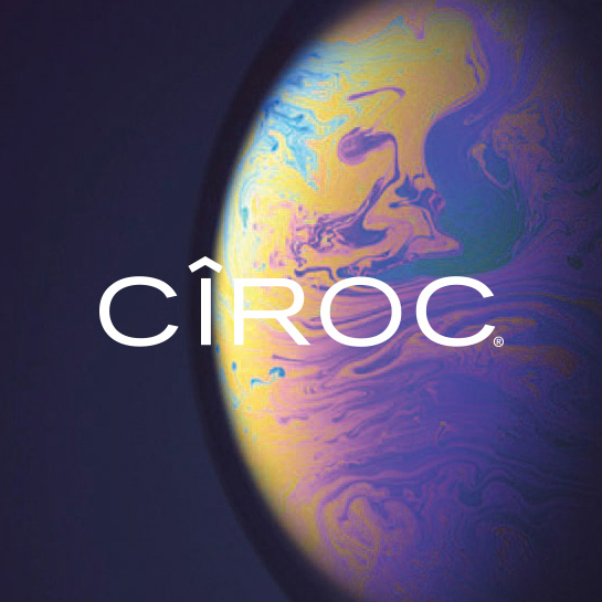
One of the world’s only vodkas created entirely from grapes, CÎROC Ultra-Premium is simply unique. The name is derived from the combination of two French words, ‘Cime’ meaning peak or summit-top and ‘roche’ meaning rock.

True to its roots, CÎROC Mauzac Blanc grapes stem from the high-altitude vineyards in Gaillac, France, overlooked by the stone village walls of Cordes-sur-Ciel.

Client: Diageo - Ciroc Vodka
Agency: Orbit
Industry: Drinks
My Role: Art and Design Direction

Inspiration

The Art of Celebration

CÎROC has always been synonymous with celebration and the task was to translate the club VIP theatre into retail experiences within Global Travel Retail. By developing a set of hero POSM and key visuals I helped create a set retail guides through which the international territories could build a consistent experience worldwide.

Tags: POSM, Point of Sale, Retail Brand Guidelines, Travel Retail Theatre & On and Off Trade Guidelines

Testimonials

Johnnie Walker Blue Label

Johnnie Walker Blue Label

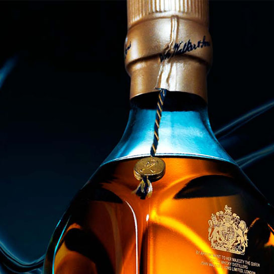
Johnnie Walker Blue Label comes from hand-selecting rare Scotch Whiskies with a remarkable depth of flavor. Only one in 10,000 casks make the cut. Best served neat, along with an ice-cold water to enhance its powerful character.

Brand: Diaego - Johnnie Walker Blue Label
Agency: Orbit
Industry: Drinks
My Role: Art & Design Direction

Inspiration

Relaunch of an Icon

Johnnie Walker Blue Label was under going a transformational redesign for the 21st Century. As part of that, we were briefed to translate the elegant and beautifully redesigned bottle into a set of retail experience spaces within Global Travel Retail. By developing the suite of hero POSM and key visuals, I helped develop the retail guides through which the international territories could build a consistent experience worldwide.

Tags: POSM, Point of Sale, Retail Brand Guidelines, Travel Retail Theatre & On and Off Trade Guidelines

Testimonials

REN

REN

REN Clean Skincare delivers high-performance products with clinically proven results from nature’s most powerful and kind bioactive ingredients always formulated with sensitive skin in mind. Sustainably sourced formulas in zero-waste packaging.

Client: Ren
Agency: Umbrella
Industry: Skincare
My Role: Retail Pop-Up Design & Management

REN

Clean Bio Active Skincare

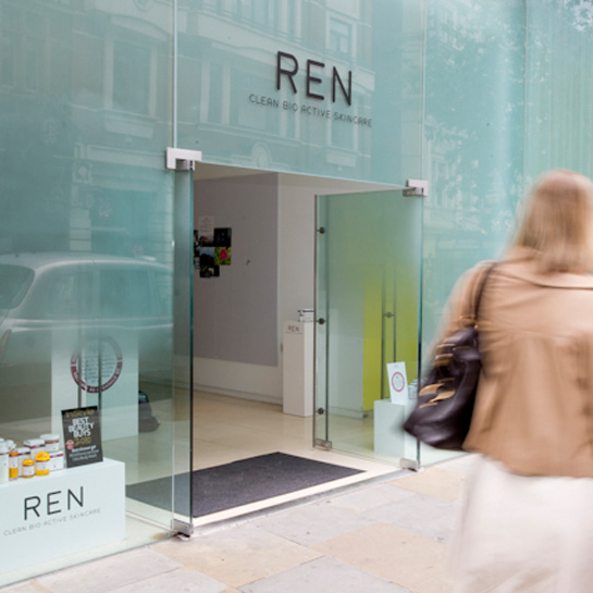
Whilst at Umbrella, I was given the task of managing the first Pop-Up store for Ren Skincare. The brief came with a strict budget and an even more pressing deadline.

I met with the client in a coffee shop opposite the space on St. Martins Lane on the Monday morning and by Thursday evening we had designed, built and installed the retail setting, ready for launch on the Friday.

Simple fixtures and clean graphics align to REN’s ‘clean’ beauty ethos.

Tags: Retail Pop-Up, Project Management & Stakeholder Engagement

Testimonials